In a recent interview, Samsung executives discussed how the company’s design language evolved into what we now know as the Galaxy S26. While it’s true that Samsung has built its identity in the mobile space through generations of refinement, the same design is at the root of some of the most annoying yet solvable issues facing Galaxy hardware.
The comments were shared by Samsung SVP Lee Ji-young (via ChoSun) earlier this month, Ji-young discussed how the 7R (the curve of a circle with a radius of 7mm) will perfectly compliment the “(Galaxy S26) product design,” pointing to elements such as “optimal corner curvature.” Meanwhile, Samsung vice president and head of mobile design group Lee Il-hwan called the vertically positioned triple camera “the main personality of the Galaxy.”
I’ve been using the base model Galaxy S26 since it was out of the box, and I’ll get my main point right up front: it’s a solid, reliable phone. The lighter chassis and slimmer design, largely driven by a year of time spent on the Pixel, have been a breath of fresh air. Back to the Pixel 10a, Google’s latest $500 Android phone feels brick-thick even without the camera stick, while the flagship Pixel 10 is surprisingly heavy when you pick it up.
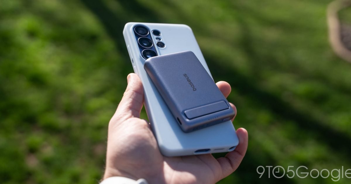
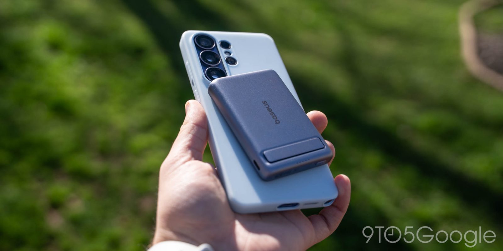
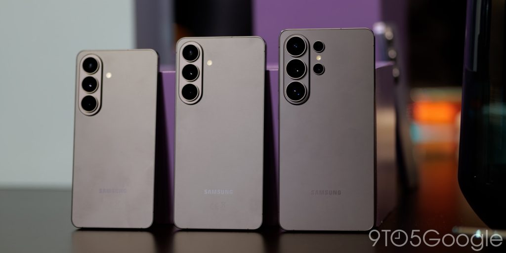
With the S26 series, Samsung has finally unified its design across the trio, forever shedding the Note DNA left over from the Ultra model. The result actually goes beyond the company’s flagship series: with the exception of foldable devices, almost every Galaxy phone released by Samsung retains the same basic design. Rounded corners, large and tall displays and a three-lens camera system directed to the left of the rear window. I can totally agree that this look is the ‘core personality’ of the Galaxy design – it also defines everything I don’t like about it.
Some of this is, of course, a matter of subjective taste. Personally, I prefer my flagship devices to have a semi-unique look compared to their more powerful mainstream entries. I don’t think it’s a bad thing to be able to instantly distinguish something that brands like Google and Apple have effectively mastered with devices like the Pixel 10a and iPhone 17e at half the price of a $1,100 device. Samsung takes the opposite approach; most of its A-series entries are easy to mistake for something higher-end at a quick glance from behind. In theory, this confirms Samsung’s design as both unique and iconic, but unlike Google’s camera bar design, I’d argue that this style is simply too anonymous to work.
It doesn’t help that Samsung isn’t alone in sporting this look. For example, the last few flagship iPhones have been replaced by a dual-camera design that doesn’t look too different from any random Galaxy device released this decade. Apple says it ditched its previous diagonal layout to allow for Vision Pro-enabled video, but either way the result is the same: Samsung’s design suddenly looks a lot like its bitterest rival. Even if this has nothing to do with the decision Samsung made publicly, the brand still has to deal with someone encroaching on its territory.
We’ve seen Google move a little more nimbly in this space. The company’s camera bar seems ripe for inspiration these days: the iPhone Air, the iPhone 17 Pro, and even Samsung’s own Galaxy S25 Edge all carry a bit of Pixel DNA in their respective lens configurations. But Google’s style — introduced five years ago in the Pixel 6 before seeing several generations of refinement — stands out against similar styles because it so unique. It’s not just the lens arrangement, but the specific style of the camera housing, the lens hood, the matching two-tone design, and perhaps most importantly, the complete absence of table wobble.
This is the real problem with Samsung’s ‘core personality’. It’s not so much that other companies have used similar designs, but the way the Galaxy looks in 2026 presents a fundamentally flawed experience. While companies like Google have fully addressed camera shake issues that make devices wobble back and forth on flat surfaces, Samsung’s device wobbles more than ever. Rotating the lenses 90 degrees can effectively fix this, but it violates the company’s own ideals of how its products should work.
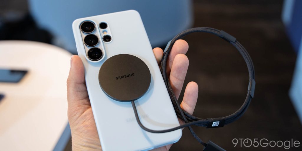
But nothing drives me madder than how this affects Qi2 support. Lots of (digital) ink It has decided to rely again on Samsung’s decision to refuse to include built-in support for Qi2 magnetic wireless charging. first and third party work adding that feature after the fact. That’s annoying enough on its own – at least twice while using this device I resorted to out of habit before remembering that Qi2-enabled accessories wouldn’t work with my S26 – but even if if you buy a supported shell, it may not work with every accessory. Wallets, Pop Sockets, and certain chargers are known to have issues fitting properly thanks to the inferior lenses on Samsung’s vertical camera pill, and good luck maintaining a consistent 25W charging speed.
The result, while certainly identifiable, is a design that leaves Galaxy S26 owners with a worse experience than they might find on other phones. first-party accessories are designed around these shortcomings. I’m not saying that Samsung can’t find a recognizable look and feel that matches its branding – and frankly, I wouldn’t mind if they found a way to do something close to their current style work – but treating it like the end of everything a smartphone can be feels more forward-looking than I’d like. Features like Qi2 weren’t available when Samsung first started using this look, but that doesn’t mean the brand should be given a pass after this generation.
FTC: We use automatic affiliate links that generate income. More.